 Printlane™ Help Center
Appearance
Templates
A template in Printlane is like a product in your online store, except that it contains all the information about how the product can be customized. For instance:
- Where can a customer add text?
- What kind of artwork can the customer add?
- Can the customer upload pictures?
- ...
When a customer opens the designer on a customizable product in your online store, all the design settings are retrieved from the template and displayed accordingly.
Creating a Template
- Navigate to the templates overview and click on the button Create template in the top right corner.
- Enter a name for your template. This name is used solely for administrative purposes.
- Enter a unique template ID. This could be the SKU or Article Code of the template in your store.
The template now has its basic information. Please proceed to step 2, Dimensions, and continue by setting the size of your template.
Dimensions
Define the width and height of your template in px, mm, cm or inches. These are usually the real-life dimensions of your product. What's configured here will also be used as the size of the export unless otherwise configured in the export settings.
- Width: The width of your template in px, mm, cm or inches.
- Height: The height of your template in px, mm, cm or inches.
- Working unit: The unit of measure used for entering dimensions or positions in this template.
- Resolution: The print resolution (DPI). In the case of a template defined in px, this value is used for calculating its physical size.
- Background image: An image of your product. This will be the bottom layer when opening this template in the product customizer.
Configuring Areas
After configuring the dimensions of your template, it's time to add some areas.
What are Areas?
Areas are rectangles drawn on top of the template's image and can be used to:
- Indicate where layers are visible (e.g. to prevent customers from positioning layers where they shouldn't be positioned).
- Position layers (e.g. in the center of an area).
- Resize artwork and pictures (e.g. to fill the area's dimensions upon loading).
Using areas isn't required, but it can greatly expedite the time needed to create templates.
How to Create an Area?
Instructions:
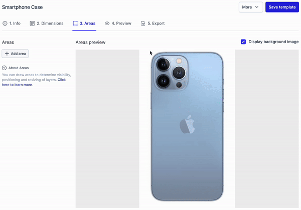
- Navigate to the item Areas.
- Click and hold your mouse button on the template image.
- Drag to a position to create the area and release the mouse button.
- Change the area's position and size using your mouse, or by modifying the coordinates on the right-hand side.
- Name your area for future reference.
How to Use an Area?
One of the most common use-cases of areas is to limit the visibility of a layer. For instance, when you want to show the full product in the editor, but only a part of the product can be customized.
Instructions:
- Create or edit a template and proceed to the step Preview (Step 4).
- Add a layer and click on the cog icon next to the layer.
- Navigate to the step position and set the visibility to your area.
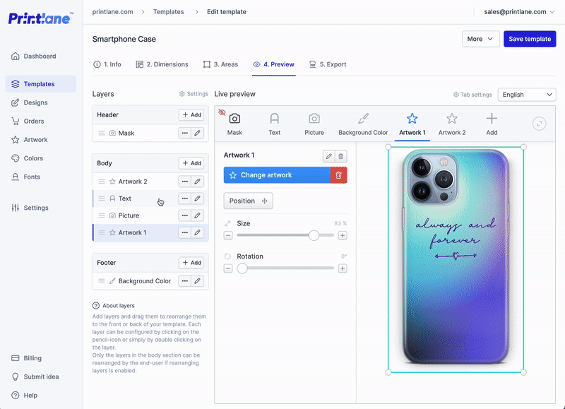
Adding layers
There are five kinds of layer which you can add to your templates:
- Text
- Picture
- Artwork
- Background
- Mask image
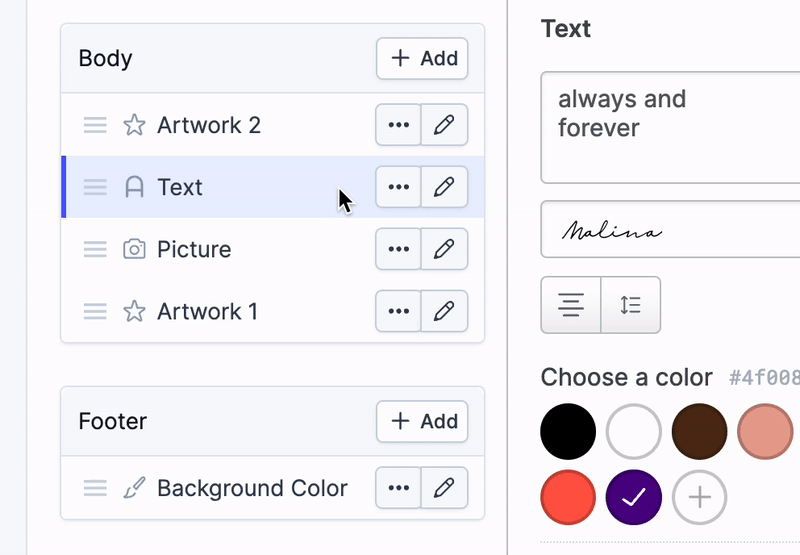
Text
A text layer allows the customer to add text to the template. Click the button + Add layer and choose Text. On the right side of the page, you'll see a live preview of how the layer will appear in the app. You can adjust the position and settings directly in this preview.
Double click the layer or click on the pencil icon to modify the settings of the layer.
Available settings:
Value
- Field name: The name displayed above the layer settings in the designer.
- Multiline: Check this box to allow the customer to enter multiple lines of text.
- Text alignment: Choose how the text should be aligned by default.
- Maximum characters (optional): Optionally, enter a maximum number of characters the customer is allowed to enter. Set to 0 to allow an unlimited number (default).
Font and Size
- All fonts: Check the box to allow the customer to choose from any font. If you uncheck the box, you can handpick the fonts the customer is allowed to choose.
- Default font: Choose which font is applied by default.
- Default font size: Choose which font size is applied by default.
- Minimum font size: Choose the smallest font size the customer is allowed to choose.
- Maximum font size: Choose the largest font size the customer is allowed to choose.
Color
- Allow new colors: Check the box if the customer is allowed to choose their own colors using a color picker.
- Color selection: The list of colors displayed by default when opening the designer. Add your own colors by clicking on the Add color button, or remove colors using the Remove button. Optionally, you can enter a name for each color, which will be displayed as a tooltip when hovering over the color.
Position
- Visible in: Choose where the text should be visible. By default, the text is visible in the entire template. If you have assigned areas to the template, you can choose here to limit the visibility to that area. When the customer drags the text outside of the area, it will no longer be visible.
- Position: The X and Y position in pixels calculated from the top left of the template. This position is by default the center of the template. You can change it manually, or set it to the center of another area.
- Rotation: The rotation of the text in degrees when opening the designer (non-rotated by default).
Extra
- Draggable: This indicates whether the customer is allowed to change the position (allowed by default).
- Rotatable: This indicates whether the customer is allowed to rotate (allowed by default).
- Resizable: This indicates whether the customer is allowed to resize (allowed by default).
- Non-editable: This indicates whether the customer is allowed to make changes to the layer. If the layer is non-editable, it is visible but cannot be selected or modified by the user.
- Required: This requires the customer to enter at least one character to be able to create a design.
- Export: This indicates whether the layer should be included when exporting a design of this template.
Picture
A picture layer is used to allow the customer to add a picture to the template. Click the button + Picture to add a picture layer.
On the right side of the page, you'll see a live preview of how the layer will be shown in the designer. You can position and change settings directly in this preview.
Additional settings are available under the cog icon.
Available settings:
Value
- Field name: The name shown above the layer settings in the designer.
- Description: Text shown with this layer in the designer, this can contain extra information or instructions.
- Allowed file types: Configure which file types the user can upload in this layer.
- Default picture: Choose which picture is shown by default.
Size (Configure the minimum resolution and default scaling)
Minimum resolution for raster images: Configure the quality of images that you want to receive from the user.
- Default: Use the template's resolution and consider your store's maximum image scaling setting. This ensures images meet your base quality requirements while respecting the default scale you set.
- Custom Resolution: Specify the minimum number of pixels per inch (PPI) required to fill the picture layer. This offers more precise control over image quality.
- No Resolution: Allow users to upload images of any size. This provides flexibility but may result in lower-quality images that appear pixelated when scaled.
When picture is updated: Choose how new images are displayed within the designated area.
- Fill: The image will be scaled to completely fill the designated area.
- Fit: The image will be scaled to fit within the designated area while maintaining its original proportions.
Important Note: Scaling will always consider the minimum resolution setting you defined. The image will be scaled as close as possible to this resolution while respecting the chosen behavior (fill or fit). This ensures uploaded images meet your quality standards.
Size requirement: Control how we handle images that are too small or don't fully cover the designated area.
- Warn: Users will be notified if the image is either too small to fill the area or doesn't cover it entirely. They can still create the design, but the image might appear blurry or incomplete.
- Error: Users won't be able to create the design until they upload an image that's both large enough and covers the entire designated area.
Position
- Visible in: choose where the picture should be visible. By default, the picture is visible in the entire template. If you have assigned areas to the template, you can choose here to limit the visibility to that area. When the customer drags the image outside of the area, it won't be visible anymore.
- Position: the X and Y position in pixels calculated from the top left of the template. This position is by default the center of the template. You can change it manually, or change it to the center of another area.
- Rotation: the rotation of the picture in degrees when opening the designer (non-rotated by default)
Extra
- Draggable: Indicates if the customer is allowed to change the position (allowed by default).
- Rotatable: Indicates if the customer is allowed to rotate (allowed by default).
- Resizable: Indicates if the customer is allowed to resize (allowed by default).
- Non-editable: Indicates if the customer is allowed to make changes to the layer. If the layer is non-editable, the layer is visible, but it can't be selected or changed by the user.
- Required: Requires the customer to upload a picture to be able to create a design.
- Export: Indicates if the layer should be included when exporting a design of this template.
Artwork
An artwork layer is used to allow the customer to choose from your artwork library and add it to the template. Click the button + Artwork to add an artwork layer.
On the right side of the page, you'll see a live preview of how the layer will be shown in the designer. You can position and change settings directly in this preview.
Additional settings are available under the cog icon.
Available settings:
Value
- Field name: the name shown above the layer settings in the designer.
- Description: Text shown with this layer in the designer, this can contain extra information or instructions.
- Limit selection to Artwork groups (optional): Define groups of artwork the customer can choose from.
- Default artwork: choose which artwork is shown by default.
Size (Configure the minimum resolution and default scaling)
Minimum resolution for raster images: Configure the quality of the used artwork.
- Default: Use the template's resolution and consider your store's maximum image scaling setting. This ensures the selected artwork meets your base quality requirements while respecting the default scale you set.
- Custom Resolution: Specify the minimum number of pixels per inch (PPI) required to fill the artwork layer. This offers more precise control over image quality.
- No Resolution: Allow users to select artwork of any size. This provides flexibility but may result in lower-quality images that appear pixelated when scaled.
When picture is updated: Choose how artwork is displayed within the designated area.
- Fill: The artwork will be scaled to completely fill the designated area.
- Fit: The artwork will be scaled to fit within the designated area while maintaining its original proportions.
Important Note: Scaling will always consider the minimum resolution setting you defined. The artwork will be scaled as close as possible to this resolution while respecting the chosen behavior (fill or fit). This ensures the chosen artwork meets your image quality standards.
Size requirement: Control how we handle artwork that is too small or don't fully cover the designated area.
- Warn: Users will be notified if the artwork is either too small to fill the area or doesn't cover it entirely. They can still create the design, but the artwork might appear blurry or incomplete.
- Error: Users won't be able to create the design until they select artwork that's both large enough and covers the entire designated area.
Position
- Visible in: choose where the artwork should be visible. By default, the artwork is visible in the entire template. If you have assigned areas to the template, you can choose here to limit the visibility to that area. When the customer drags the artwork outside of the area, it won't be visible anymore.
- Position: the X and Y position in pixels calculated from the top left of the template. This position is by default the center of the template. You can change it manually, or change it to the center of another area.
- Rotation: the rotation of the artwork in degrees when opening the designer (non-rotated by default).
Extra
- Draggable: Indicates if the customer is allowed to change the position (allowed by default).
- Rotatable: Indicates if the customer is allowed to rotate (allowed by default).
- Resizable: Indicates if the customer is allowed to resize (allowed by default).
- Non-editable: Indicates if the customer is allowed to make changes to the layer. If the layer is non-editable, the layer is visible, but it can't be selected or changed by the user.
- Required: Requires the customer to select artwork to be able to create a design.
- Export: Indicates if the field should be included when exporting a design of this template.
For more information about artwork, go to the section about artwork.
Background
A background layer is used to allow the customer to choose the background color of the template. Click the button + Background to add a background layer.
On the right side of the page, you'll see a live preview of how the layer will be shown in the designer. You can position and change settings directly in this preview.
Additional settings are available under the cog icon.
Available settings:
Value
- Field name: The name shown above the layer settings in the designer.
Color
- Allow new colors: Tick the checkbox if the customer is allowed to choose their own colors using a color picker.
- Allow transparent color: Tick the checkbox if the customer is allowed to choose transparent as a possible color.
- Color selection: This is the list of colors that's displayed by default when opening the designer. Add your own colors by clicking on the Add color button, or remove colors using the Remove button. Optionally, you can enter a name for each color which will be displayed as a tooltip when hovering over the color.
Position
- Visible in: Choose where the background layer should be visible. By default, the background layer is visible in the entire template. If you assigned areas to the template, you can choose here to limit the visibility to that area.
Extra
- Non-editable: Indicates if the customer is allowed to make changes to the layer. If the layer is non-editable, the layer is visible, but it can't be selected or changed by the user (background layers are non-editable by default).
- Required: Requires the customer to select a (non-transparent) color to be able to create a design.
- Export: Indicates if the layer should be included when exporting a design of this template.
Mask image
A mask is essentially a picture layer which is non-editable. This is used to put an additional image on top of the template and can be useful for templates that can only be partly customizable or the customizable part has a special shape.
On the right side of the page, you'll see a live preview of how the layer will be shown in the designer. You can position and change settings directly in this preview.
Additional settings are available under the cog icon.
Available settings:
Value
- Default picture: Choose the mask template that is shown.
Position
- Visible in: Choose where the mask should be visible. By default, the mask is visible in the entire template. If you assigned areas to the template, you can choose here to limit the visibility to that area.
- Position: The X and Y position in pixels calculated from the top left of the template. This position is by default the center of the template. You can change it manually, or change it to the center of another area.
- Scales to: Scale the mask to the entire template or to a defined area. The following scale options are available:
- Do not scale: Do not scale the mask at all, it will be shown as is.
- Fill: We scale the mask up until it fills the entire template or area. (Note: We do not stretch the pictures, dimensions will be respected)
- Fit in: If the mask does not fit the template or area, we scale it until it fits.
- Rotation: The rotation of the mask in degrees when opening the designer (non-rotated by default)
Example of a mask:
| Template | Mask | Result in the designer |
|---|---|---|
 |  |  |
Copying
A quick way to setup your templates is to create a layer, configure it exactly the way you want, and use the Copy functionality to quickly add layers with the same configuration:
Multiple views
What are views?
You can create templates with multiple views that can be customized, for example, a t-shirt with a customizable front and back side.
To make a view as dynamic as possible, each view has its own layers and template image.
Adding a view
Adding a view is easy, just follow a few simple steps:
- Navigate to the templates overview and create or edit a template.
- When on the template detail page, make sure you're on step 1 called "1. Template."
- Click on the "Add new view" button and enter a name and view template image, then save the view.
- You'll see that a view switcher became available on the other steps, use this switcher to change the context to another view.
- Start defining areas and layers for this view. Define areas
Editing a view
To edit a template, navigate to the first step (1. Template), click on the view you want to edit. A dialog is shown where you can make the changes, save the product afterward.
Deleting a view
To delete a view, navigate to the first step (1. Template), click on the view you want to delete. A dialog is shown with a remove button in the bottom left corner.
Copy a template
To simplify template creation in Printlane Studio, you can copy templates that are similar:
- Navigate to the template overview.
- Click on the copy button.
- Enter a Name and a unique template ID for your copy.
- Click on the copy button.
You now have an exact copy of the template you created before. Changes to the original template won't affect the copy or vice versa.
Delete a template
To delete a template, click on the Delete button in either the overview of templates or when editing a template. After confirming, the template is deleted.
Designs of the deleted template won't be affected.
Export settings
In the export settings screen, you can define how to export your customers' designs from Printlane Studio.
Export size
The size of the export is defined in the working unit of your template and based on the dimensions (width and height) of the template. If you change the export size to an area, you will see that the dimensions will change to the dimensions of the area.
Export fields
By default, the template and all the layers you created will be included in the export. If you would like to exclude the template or layers, simply uncheck their checkboxes to exclude them.
File type
You can export designs in 3 different formats:
PDF document:
- Contains individual layers.
- Original images are included without any conversion of any kind.
- Texts are converted to outlines automatically.
PNG Image:
- A plain image containing transparency.
- Images are included and converted to web-friendly sRGB.
PDF document (PNG based):
- A PDF document containing one layer.
- Images are included and converted to web-friendly sRGB.
- The single layer contains a transparent PNG image matching the PNG export.
Which file type should you use? This depends on your procedure in processing in-store orders: If you work with graphic design software like Adobe Photoshop, Adobe Illustrator, or Adobe InDesign, we advise using a PDF-based export.
Since a PDF document contains additional metadata like DPI, which you can use to match your print-ready files.
The default PDF export includes original images and converts text to outlines. If you prefer the images to be converted automatically to sRGB and don't need text outlines, you can use the PNG-based PDF export.
If you only need an image that displays the customer's design for future reference, you can export designs in PNG format.
Dots Per Inch (DPI)
The dots per inch (DPI) setting is available when you export to PDF. This setting defines the number of pixels printed within a physical inch.
The behavior of the DPI setting in Printlane depends on the working unit you've configured in the dimensions step of your template.
Template working unit set to px
When the working unit of a template is set to px, the DPI value determines the physical dimensions set on the exported PDF.
Here's an example:
| Template Size in px | Export DPI | Physical Size of the Export in Inches | Physical Size of the Export in cm |
|---|---|---|---|
| 1000 x 1000 | 300 | 3.33 x 3.33 | 8.47 x 8.47 |
| 1000 x 1000 | 150 | 6.67 x 6.67 | 16.93 x 16.93 |
| 1000 x 1000 | 100 | 10 x 10 | 25.40 x 25.40 |
Template working unit set to mm, cm, in
For templates with the working unit set to mm, cm, in, the DPI value determines the template's dimensions in px.
This is crucial because the dimensions in px determine the size of the images that your customer needs to upload to completely fill the canvas.
Tip: Keep the size in px of your templates as small as possible. This makes it easier for your customers to find an image that completely covers your product and might increase conversion.
An example:
| Physical size in cm | DPI | Template dimensions in px | Image size your customer needs to upload |
|---|---|---|---|
| 90 x 60 | 300 | 10630 x 7087 | 10630 x 7087 |
| 90 x 60 | 150 | 5315 x 3544 | 5315 x 3544 |
| 90 x 60 | 100 | 3544 x 2363 | 3544 x 2363 |
TIP
Still confused about image resolution, megapixels and DPI? We've got you covered. Please find some resources offering more information and feel free to contact us if we can assist you.
Enabling templates for your customizable products
To enable products to be customized in your store, please head over to the Integrations section to connect your store with Printlane.